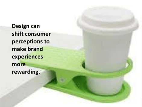
Emotions help us to understand, learn and connect to the world around us. They help us stay connected to objects on three levels: visceral, behavioral and reflective levels.

To make a good design, the designer must create responses to all these 3 levels, in order provide a desired experience, be it positive or negative emotion, depending on the context. For example, a UX designer for a horror-themed game will have to provide experiences for enjoyment (positive) and an adequate level of fear (negative).
The visceral level is our first reaction to something new, so it is one of the most important aspect of design. In the online world where people “zap” quickly to a new content every second – 3 seconds on social media, design has to be incisive.
The behavioral level is the “usability” part of design, it resonates with the innate sense of a product or content, how well it performs and how easy it is to use it. In the web context, it relates to how easy it is to navigate the site.
The reflective level is about the projected emotion, how it makes me feel about using the product. It’s the one of the most effective way to fidelize and sustain a customer.
If a designer can create these 3 links between the customers and products, the desire for your product will be very strong.
How to measure online emotional engagement
Let’s start with the basics: an emotion is a psychophysiological response in your body to a stimulus


There are many way to collect data on how people respond emotionally to a digital content, metrics like heat-map, clicks, facial recognition and pupil movements with cameras, pulse and heat with connected watches, vocal emotions with connected speakers are some of the quantitative measures and tools we can use.
With a little reverse engineering, you can use this data to identify strong emotional triggers, optimize weak elements and create stronger user experience strategies. Let’s see how to measure a Behavioral Response more precisely in the 4 following scenarios.
During the discovery stage
- Study user reactions during A/B testing on micro-sites, ad content and email campaigns
- Use metrics like page views, video views, impressions and click-through rates to track engagement
- Create dynamic content that aligns with your keywords, giving users exactly what they want as soon as they hit your page.
- Leverage strong referral sources and advertising platforms to build trust and credibility. For example an ad on a “trusted” site like Google or Amazon helps customer to be confident in you
- Use emotionally rich imagery in your advertising messages, and carry that messaging through to the website itself
- Develop intuitive and relevant architecture to decrease frustration and increase trust. First impressions count. If the bounce rate is high or the time on site is low, then the story you are telling in the awareness phase might not be carrying though to the user’s interaction on the platform
During the web visit
- Track engagement by looking at bounce rates, session lengths, pages per visit, abandonment rates, email opening rates and click-through rates
- Stay up to date on current trends in UX usability, be really user-centric.
- Identify high-focus areas in your user interface through eye-tracking, heat maps and software that records mouse movement. Optimize your framework, and place emotion-building content in strategic areas.
- Use strong emotional words and images
- Highlight brand relationships, security measures, press and certifications to improve your credibility,
- Have a clean code: no 404, unclean images, typo errors
When they are interested in your offer
- Track your social network followers, RSS feed or podcast subscribers, email newsletter subscriptions, file downloads, e-commerce conversion rates, purchase line items (both items and amount), community sign-ups, and warm leads
- Use your existing community to improve it
- Have the information people are looking for easily available
- Reiterate trust, security and credibility elements during the check-out or registration process
- Be aware of your online reputation
When they are ardent fans
- Engagements can be measured by return customers, unique versus returning visitor ratios, geo-location check-ins, and participation in reward systems
- Use strong social interfaces to spotlight followers, supporters and die-hard fans
- Use community-building messages to add excitement and enthusiasm to your products and reinforce the emotional engagement of your communities.
- Create shortcuts to integrate your products into their daily lives, like apps and open APIs
- Include fans to help shape your future, and make it easy for them to share information, spread your brand and recruit their network
- Allow users to create their own addictive community experience
Why does it matter?
UX design has the same goal as emotional marketing: to put the human first in its conception. Thus, emotional UX aims to achieve its effectiveness in the following 5 points :
- Maintain personalized relationships with target users
- Increase the conversion rate
- Promote brand recognition
- Reinforce user loyalty
- Make interaction more original
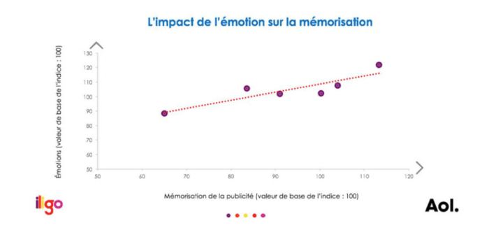
Besides emotion is a powerful memorisation tool, research shows that the more engaged the emotion is to an advertisement, the more likely it impacts the memorisation of the message.

Some examples of websites we like, dislike and abhor
The Good: Duolingo is a language learning website available on mobile applications as well. I got to know it through its mobile app while learning French a few years ago. For a start, it gives you the option to set your learning intensity level and features an intuitive system that tracks the words or categories you are not using, so that you can relearn them at the next level. Not only that, the UX design is simple, clear and attractive, thus giving pleasure to the users to continue learning.

The Bad: Craigslist is an online directory that began in the mid 1990s in San Francisco. The homepage is simply a list of links and texts corresponding to the classified groups of products and services. In this era of beautiful websites vying for attention, Craigslist’s web design looks like it has not been updated for the past 20 years. Not only that, the huge amount of lists makes it difficult to lead the eye.

And the Ugly: Penny Juice is a fruit juice wholesaler whose main customers are nurseries and schools. As you can see, the website looks like a 90s HTML site with poor navigation and awful colour scheme. What’s more, from the homepage, you don’t really have a clear idea what Penny Juice is and what they are proposing.

Conclusion
Everything around us is a result of design, good or bad and similarly, all design produces an emotion. Emotional reactions proceed our interaction with our environment, pleasure, joy, contentment or frustration, anger, irritation. It is something personal, we feel it through these emotions. Emotions are there to help us experience the world around us and good design help us to connect to otherwise inanimate objects that we use on a daily basis. If we can master the best practices of modern UX design, avoid the pitfalls of poor web navigation and improve consistently to provide an optimised user experience, we’ll be able to retain the confidence of our customers to our brand.
Resource
https://www.interaction-design.org/literature/topics/emotional-design
https://www.toptal.com/designers/product-design/design-for-emotion-to-increase-user-engagement

